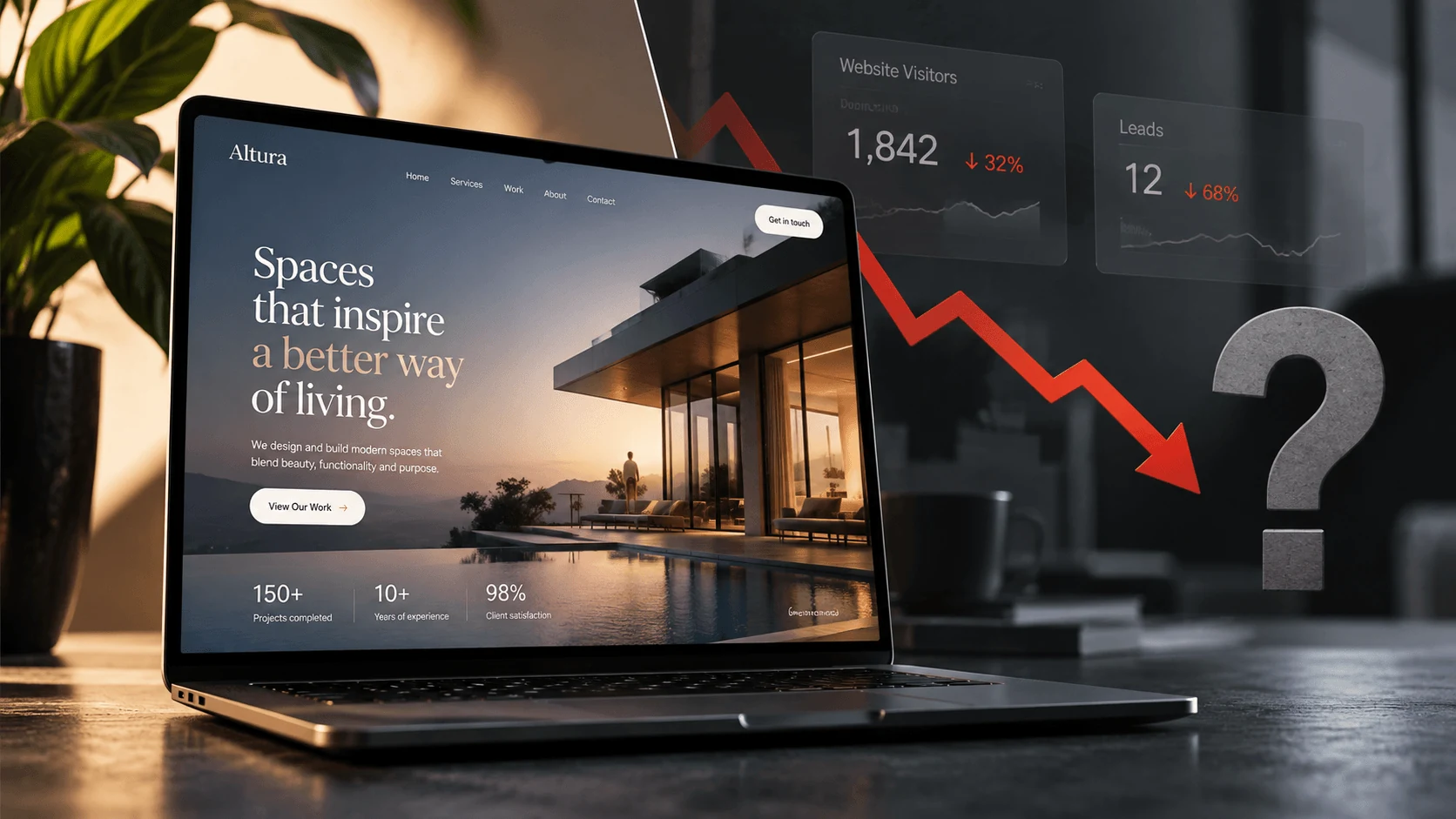
Your website is beautiful. The typography is clean, the animations are smooth, the colors work perfectly together, and everything feels polished.
You show it to people and they say things like, “Wow, this looks amazing.” “This is really clean.” “Who designed this?”
Great. But there is one question that matters much more:
Is the website actually helping your business grow?
Because a website can look incredible and still be terrible for business. It can win compliments and lose customers. It can impress other designers and confuse the people you actually want to buy from you.
And unfortunately, this happens more often than you might think.
Beautiful is not the same as effective
Somewhere along the way, businesses started treating websites like digital art galleries. Everything became about how the website looked. Big typography, fancy transitions, beautiful photography, clever animations, unusual layouts.
And none of those things are bad. We love great design.
But design has a job.
For a business website, that job is not simply to make someone say, “Nice website.” The website should help people understand your business, trust you, find what they need and take the next step.
That step might be booking a call, buying a product, requesting a quote, signing up, visiting your location or sending an enquiry. Whatever the goal is, the design should help people get there.
If it does not, you might have built something beautiful that is quietly working against your business.
The five second problem
Imagine someone lands on your homepage right now. They know absolutely nothing about your company.
Give them five seconds.
Can they answer these questions: What does this company do? Who is it for? Why should I care? What should I do next?
If the answer is no, you already have a problem. And no amount of beautiful animation is going to fix it.
Visitors should not have to investigate your website to understand your business. They should not have to scroll through three sections before discovering what you actually sell. They should not need to decode a clever headline.
Clarity almost always beats cleverness.
Instead of saying, “Building the future of extraordinary possibilities,” tell me what you actually do. If you build websites for growing companies, say it. If you help businesses generate more qualified leads, say it. If you help ecommerce brands increase sales, say it.
Your visitor did not come to solve a puzzle. They came looking for an answer.
You designed for yourself instead of your customer
This is another trap.
The website gets built around what the company wants to say rather than what the customer wants to know. So the homepage starts with, “Our company was founded in 2014…” Then comes the mission statement. Then the awards. Then another paragraph about the company.
Meanwhile, the visitor is sitting there thinking:
Okay… but can you solve my problem?
Your customer is the main character of your website, not you.
That does not mean you should never talk about your business. It means the conversation should begin with the person you are trying to serve. Their problem, their goal, their frustration and their desired outcome.
Then you position your company as the bridge between where they are and where they want to be.
Suddenly, your website stops talking at people. It starts talking to them.
That difference matters.
Your website is making people think too much
There is a simple rule worth remembering:
Confused people rarely convert.
Imagine visiting a website and seeing six buttons in the hero section: “Discover.” “Explore.” “Learn.” “Experience.” “Start.” “Connect.”
What exactly am I supposed to do?
Or imagine opening the navigation and finding fifteen different pages. Or landing on a service page where you have to read 700 words before understanding what the service actually includes.
Every unnecessary decision creates friction, and friction gives people another reason to leave.
Your website should gently guide visitors, not force them to figure everything out themselves.
Good websites feel obvious. You know where you are, you know what the company does and you know where to go next. You rarely stop to think about the interface because the interface is doing its job.
That is good design.
Your animations are slowing everything down
There is a moment when impressive becomes annoying.
Your visitor clicks the website. A loading animation appears. Then the logo animates. Then the headline fades in. Then the image slides across. Then the button slowly appears.
And somewhere behind all of that, your visitor just wants to find your phone number.
Motion can make a website feel premium. It can create personality and make an experience memorable. But animation should support the experience, not become the experience.
If someone has to wait for your design to finish performing before they can use your website, you have gone too far.
Your website is not a movie trailer. People should be able to use it immediately.
The website looks great on your laptop
Perfect.
Now open it on a phone.
This is where things sometimes fall apart. That beautiful oversized headline now takes up the entire screen. The carefully positioned graphic is covering the text. The navigation feels awkward. Buttons are too close together. The animation that looked incredible on desktop feels slow. The pricing table requires horizontal scrolling.
And the visitor leaves.
A website is not truly beautiful if it only works beautifully on one screen size.
Good design has to survive the real world: different phones, different laptops, different browsers, different internet speeds and different people.
Responsive design should not feel like the desktop website was squeezed into a smaller screen.
Mobile should feel intentional.
You forgot about trust
People do not only ask, “Do I like this website?”
They are also asking, “Can I trust these people?”
That question becomes especially important when money is involved.
You can have the most stunning website in your industry, but if there is no evidence behind your claims, visitors may hesitate.
You say you deliver results. Show them. You say clients love working with you. Let us hear from those clients. You say you have experience. Prove it.
Case studies, testimonials, recognisable clients, real projects, specific results, reviews, certifications, team members and clear contact information all help answer the trust question.
These things might not feel as exciting as another 3D animation, but they can do far more for your business.
A beautiful website gets attention. A credible website earns trust.
You buried the call to action
Your visitor likes what they see. They are interested. They are ready to take the next step.
And then… nothing.
No clear button. No obvious contact option. No next step.
Or worse, the button says something vague like “Explore possibilities.”
What happens when I click that?
People should know what they are doing before they click.
Book a Consultation. Request a Quote. Start Your Project. View Our Work. Shop Now. Get a Free Audit.
Clear calls to action reduce uncertainty.
And when someone reaches the bottom of an important page, do not simply leave them there. Tell them what happens next.
Your website has no real strategy
This might be the biggest issue of all.
A lot of websites are designed one section at a time. Hero section. About section. Services. Testimonials. Footer. Done.
But nobody stops to ask what journey a visitor should take. Where is traffic coming from? What information do different visitors need? Which pages should convince them? What objections might stop them? Where should we build trust? What action matters most? How will we know whether any of this is working?
That is where website design becomes website strategy.
And the difference is enormous.
A strategic website is not a collection of attractive sections. It is a system.
Every page has a purpose. Every section answers a question. Every call to action moves someone forward. Every design decision supports a business goal.
So, does this mean your website should be ugly?
Absolutely not.
Beautiful design matters. People make judgments quickly. Strong design can make your company feel credible, modern and valuable before someone reads a single paragraph.
The problem is not beauty.
The problem is beauty without purpose.
The strongest websites do both. They look great and work hard. They create emotion without sacrificing clarity. They feel distinctive without becoming confusing. They impress people without getting in their way.
They communicate the brand while still making the customer’s journey ridiculously easy.
That is the goal.
Stop asking whether your website looks good
Ask better questions.
Can people understand what we do quickly? Can they easily find what they need? Does the website give them reasons to trust us? Is the experience excellent on mobile? Is there a clear next step? Are people actually taking that step? Is the website generating enquiries, sales or opportunities?
Because your website is not supposed to sit there looking pretty.
It is supposed to work.
It should be one of the hardest working assets your business owns.
And if people keep telling you how beautiful your website is but your leads, enquiries and sales tell a very different story, you probably do not have a design problem.
You have a business website that was designed to be admired instead of designed to perform.